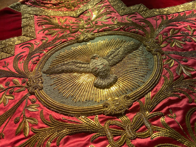
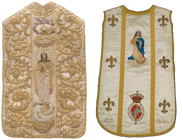
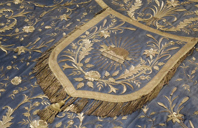
Some might rightly point out that if one looks at the later medieval and earlier Renaissance vestments, one can find many examples of vestments that carry multiple images on them. This is true. However, the way this was gone about helped to unite these various images into a unified whole. Historically, vestments which contained imagery frequently contained them within orphreys, frequently also employing geometric or architectural motifs. This particular approach helped to create a greater unity and visual simplicity.
So then, what is the angle here? Just as sanctuaries can become cluttered (too much furniture peppered all over the sanctuary, too many disparate statues and images that are not united by some unifying visual force, like a reredos) the same can happen with vestments. So then, if I might make some suggestions, it would be as follows:
1. Start by asking whether a symbol or image is actually needed. If the vestment intends to promote some particular liturgical angle, such as a patronal feast day, if it intends to be specifically Marian, etc. then, yes, an image or symbol may be worth considering to help explicitly make this connection explicit. If that is not the case, however, make your focus instead on the beauty of the cut and colour, the nobility of the materials, ornamentation and so on.
2. In terms of ornament, naturalistic motifs as represented in damasks, brocades, lampas and so on, are frequently more than sufficient, as can be something as simple as complimentary colour combinations that help unify the rest of the design with any imagery included.
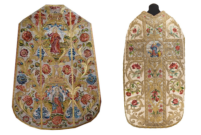 |
| Two successful examples of how the images are tied into the rest of the decorative scheme of the chasubles. Also see the next example below. |
3. If you are absolutely set on employing a symbol or image, remember the principle that frequently less can be more. A well placed and well proportioned symbol/image (i.e. not too large) can frequently have greater impact or better visual result than either filling a vestment full of them or placing very large images on them. Sacred vestments are not billboards.
 |
| Left: A well proportioned IHS design. Right: Bigger isn't always better -- and frequently it comes off as kitschy and tasteless. |
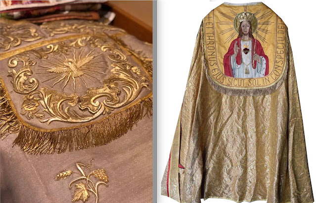 |
| Left: A well proportioned design on the hood of a cope. Right: A poorly proportioned design on the same. |
4. If multiple images 'must' be used, ensure that there is a consistency to them and consider using the orphrey as a way to visually unite and contain these images, much like they did in the Renaissance and earlier. Ideally, try to find ways to unite these images to other parts of the design, by use of complimentary colours and designs (such as those examples shown in 2) to help ensure that they integrate seamlessly with the rest of the design,
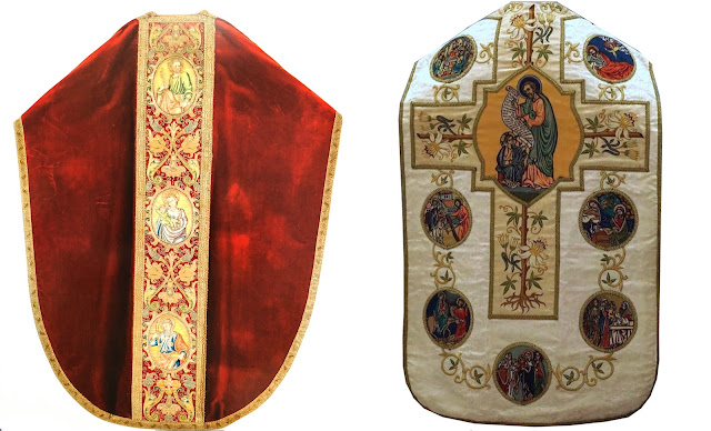 |
| Left: Symbols/images successfully contained and visually unified within an orphrey. Right: Symbols placed all over the chasuble. This works far less successfully, creating visual clutter. |
5. Colour is frequently part of the problem with contemporary inclusions of symbols and images. If colours 'must' be used, try to avoid bright primary colours and lean toward antique looking colours, darkened shades or pastel shades in particular work well. One of the best options, however, is to utilize golds and silvers to create more monotone imagery. This is especially important where larger imagery is being used (though in general, larger imagery is likely best avoided).
Finally, as an overarching principle in all this, study the 'ancients' (proverbially speaking). A chasuble is not like a t-shirt or billboard; it is not a place for sticking logos (symbols) or large images like you might with your favourite sports team, band or what not. Look to the designs of the past and learn from them. Learn what makes one design work and another not. Follow this and one is far more likely to end up with a beautiful and noble design.


