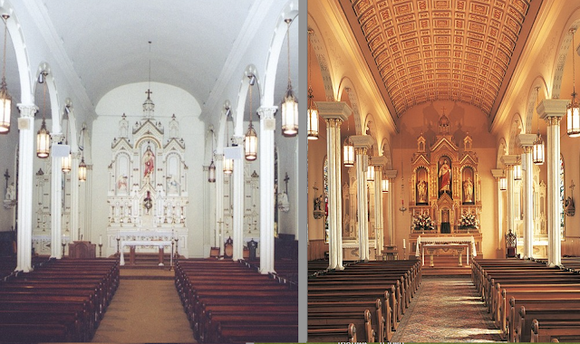
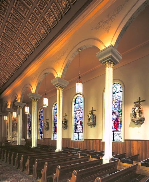
We're pleased to present another before and after coming from out of Conrad Schmitt Studios. Like some of the previous examples we have shown from them, this is not a case of a before and after attached to radically renovating some previous space, but instead a case of taking an existing space and finding ways to improve on it. The studio sets the stage for us:
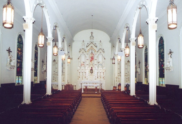
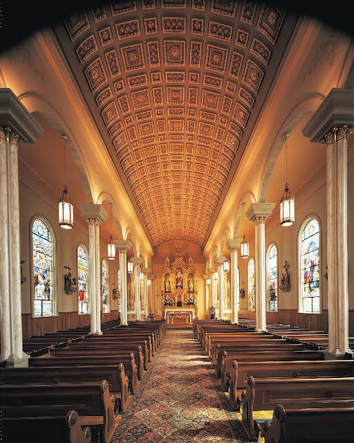
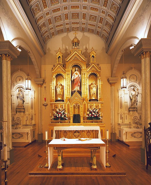
St. Peter Catholic Church in Montgomery, AL, was originally built in 1834 and designed by architect John P. Dickerson. Over a century later, the parish sought to renew its spiritual environment with an embellished decorative scheme. Specifically, a new altar, ambo, baptismal font, and restored Stations of the Cross. A warm color palette and gilded accents were chosen to create a welcoming environment for the church. The decorative molded plaster ceiling was added to draw the eye upward and toward the altar. The font, altar and ambo are inspired by the church's architecture and incorporate marbleizing, gilding and stained oak. The original high altar, formerly white, has been gilded, burnished and glazed to serve as a beautiful backdrop for the liturgy. The Stations of the Cross, formerly white, were brought to life with realistic coloration and added gold leaf accents.The 'before' state of the parish, came with a distinctly 'white-washed' and unfinished feeling to it, and of course, the starkness of the white can indeed make the space feel father cold, lifeless and unfinished.
BEFORE
However, as we shift into the newly instituted decorative scheme, we do indeed move from a much cooler space, to one clearly more inviting and certainly more decorative. What is especially impressive is the new coffered ceiling that has been installed, effectively leading one's eye down the nave, to the reredos and ultimately the altar itself.
AFTER
Normally one would look to remove aisle carpeting in projects such as this, but I have to say, the new Persian style rug that goes does the central aisle seems to work very nicely, creating a cosmatesque like ornamental counter-balance to the coffered ceiling above.
Certainly as well, the newly coloured and gilt reredos also comes off quite a bit more nicely, accentuating its ornamental details and also making it look more like the wood that it actually is rather than the faux white stone that it is not.
-------
Do you like Liturgical Arts Journal's original content? You can help support LAJ in its mission and vision to promote beauty in Catholic worship either by:
You pick the amount! Your support makes all the difference.


