How to Simply Achieve Noble Beauty, Simplicity and Romanitas in Altar Design

Let's imagine a scenario. You're building a parish perhaps, or perhaps renovating one; you want to build an altar, one that is both a linkage to the tradition as well as an expression of noble beauty and simplicity as historically expressed in the Roman tradition.  So what do you do? 

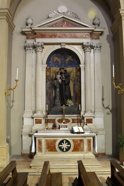
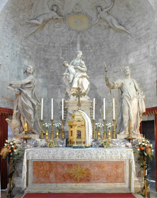
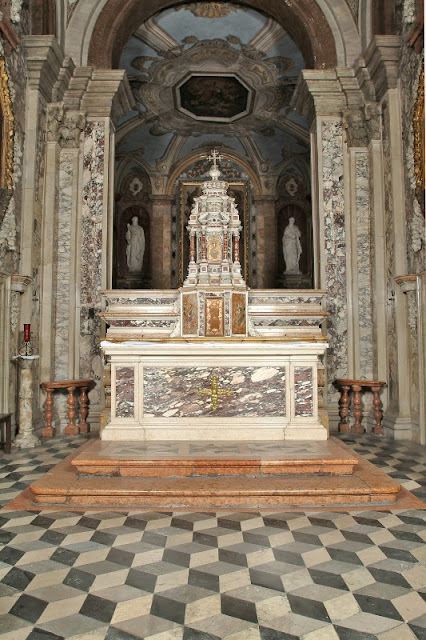
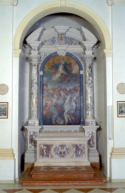
Regardless of whether this is a situation you'll ever find yourself in, there is an all too obvious design option that exists, one that meets all of these criteria -- and should also meet budgetary demands as well. What is that option? As is so often the case, the answer can be found in some of the great historical basilicas of Christendom -- namely, the use of polychrome marble revetments set into simple geometric patterns. 

Designs such as these characterize the great Roman basilicas in general, including those found in the East in places such as Constantinople. They involve the use of coloured slabs of marble that utilize very basic geometric shapes: circles, ovals, rectangles and so on. It sounds very simple and that is because it is -- and yet the effect is one of great beauty. 

Too often since the nineteenth century we've become fixated on placing images and complicated designs on most anything. These have a place of course and when done well, they can be extremely edifying, so to be clear, I am not advocating this be abandoned; I am simply highlighting another option to consider. 

Let's take a look a few examples coming from different centuries -- and as you'll see, the century really doesn't matter as there is a certain timelessness to these designs (which is exactly what you want in my estimation).
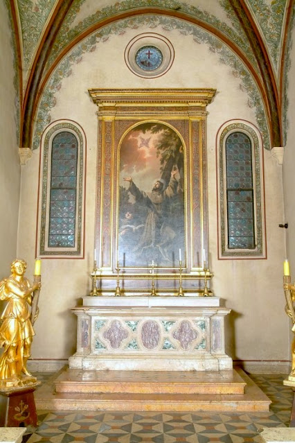
Venice, 1656

Italy, 19th century

Westminster Cathedral, London, late 19th to early 20th century

Italy, 1740-1760

Venice, 1700-1710

Italy, 1740-1760

Designs such as these can work well either on altars that have an attached reredos (as those shown above) or which are fully freestanding. If you don't believe me, just take a look at these further examples which give a close up of some similar altars; each of these can easily be re-imagined in the free-standing, basilica form.  Most of these designs, which range from the 1600's through until the first half of the twentieth century are comprised of very simple geometric designs, but for those who still wish a certain amount of explicit symbolism (beyond the primary symbol of the altar itself) I have also included some comparable designs that also include crosses, and in one instance, the Agnus Dei. (Because of the number of examples, I will keep these images small and invite you to simply click to enlarge those you wish to see better). 


I've tried to include some different types of geometry in these examples and, of course, this style also has the potential to be made even more ornate than these, as in the instance of this "amped up" version of this same style taken from Padua circa 1690-1710:


There are many such examples as that shown immediately above and while I would make you aware of it, the main focus here are rather on these other designs; designs which illustrate how something as simple as noble materials, a bit of colour, and some simple geometric interactions can make for an altar that is characterized by its noble beauty, its noble simplicity, as well as the tradition of Romanitas.  

This is an option that I hope architects and parishes will consider if they are ever looking to upgrade their current altars. 

------
Do you like Liturgical Arts Journal's original content? You can help support LAJ in its mission and vision to promote beauty in Catholic worship either by: 


You choose the amount! Your support makes all the difference.
 

Join in the conversation on our Facebook page.

Share: