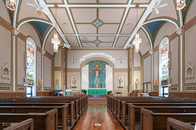
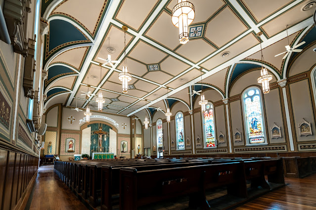
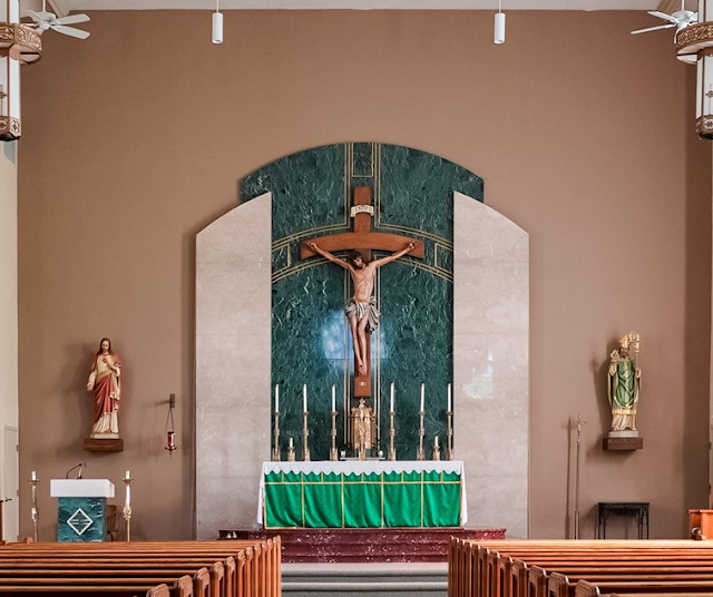
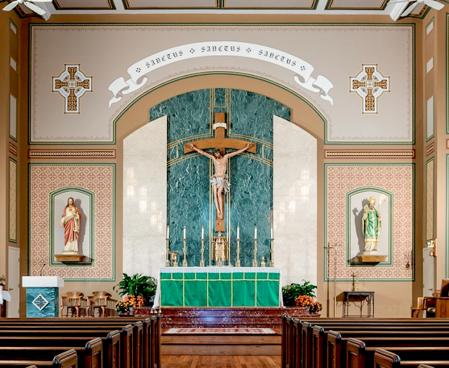
The church, which was originally built in the 19th century, had some typical mid-twentieth century design features that would have been from later renovations. A very neutral palette had been used throughout. What this resulted in was an accentuation of the flatness of the ceiling and lack of depth found in the sanctuary. This was further put at odds with the arches and windows going along the nave which have greater architectural ornament to them. The result was very not only very 'boxy,' the central nave and sanctuary seemed less prominent than the walls to either side of the church.
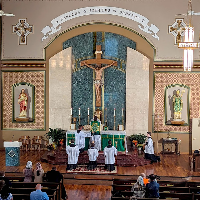
Enter Conrad Schmitt. Their approach did not involve having to make structural modifications. Instead it revolved around the introduction of painted stencilling to the walls, ceiling and sanctuary. The net result is impressive indeed.
AFTER:
-------


