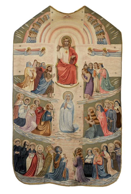
Longtime readers of LAJ will know that as a rule I'm not a huge proponent of what I term, "scenic chasubles" (meaning, chasubles where the entire surface it made into a single scene akin to a painting). Generally the reason for this is that these approaches frequently come at the expense of key elements such as the orphrey. They also can become a bit busy -- for it's one thing to have floriated ornamentation covering the entirely of the surface of a chasuble, but quite another thing to have a large variety of figures in, often different postures, positions, dress, facial expressions, etc. The latter requires much more mental processing and easily gets busy and out of control. But that's is me and some people love this type of work, so I wanted to share today an All Saints inspired chasuble that is dated to 1936. I would say it actually does a much better job than most other chasubles in this genre, on the backside at lest, for the main reason that the orphrey, despite the lack of galloons, is still clearly delineated.
The back includes a central image of Christ enthroned and beneath him, the Virgin. Around them are various saints, kneeling upon clouds in adoration. Choirs of angels can also be found above and beside the figure of Christ.
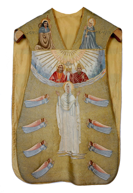
The front side, however, is less successful, both compositionally, and also due to the lack of a clearly defined orphrey. The front includes images of the Holy Trinity (in the space that would be the horizontal bar of the Tau-cross orphrey, with the Virgin Mary (who is being crowned) occupying the vertical space that would be the rest of the orphrey cross. Once again, angelic beings are found. Somewhat curiously, two images sit above the Holy Trinity depicting St. Jacob and St. Hilary; the fact they are singled out in this way suggests they had some particular patronal importance.
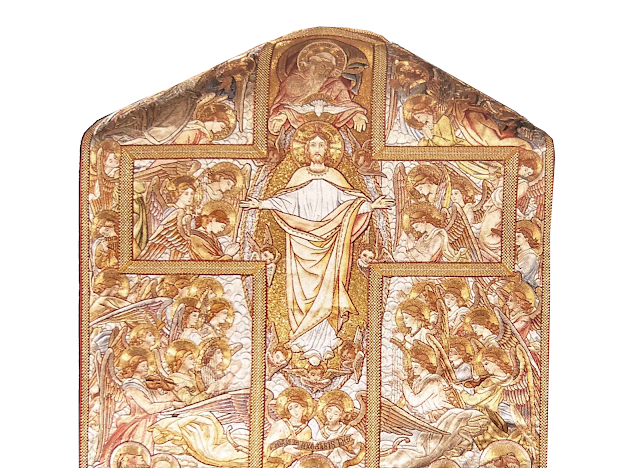
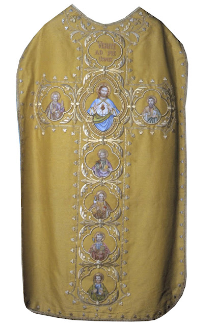
Speaking personally, if one wishes to put multiple saints on a chasuble in a scenic fashion, to my mind the best way to do that would by (a) keeping clear and distinct orphreys using galloons and (b) make the figures more subtle by making them monochromatic (e.g. in tones of silver and golds for example). Here is an example of the sort of thing I mean:Another option, of course, would be the more classic approach made in this regard, accomplished by simply organizing figures within the orphrey itself, as in this French example of the early twentieth century:
-------
Do you like Liturgical Arts Journal's original content? You can help support LAJ in its mission and vision to promote beauty in Catholic worship either by:
You choose the amount! Your support makes all the difference.


